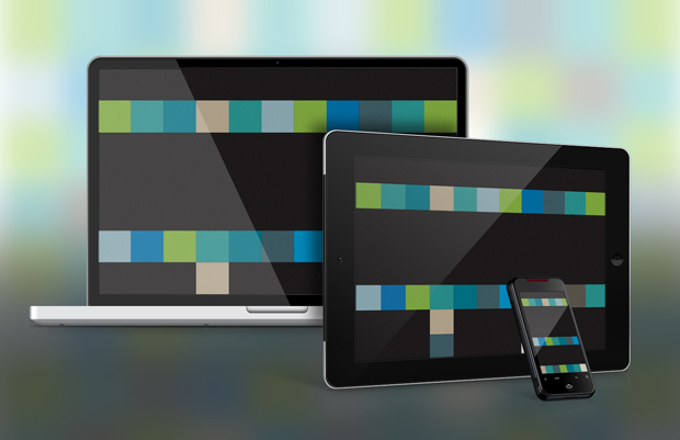
It’s no longer a question about whether or not we need to design for multiple devices and platforms for today’s consumer. The question now is how.
Enterprises—corporate, government, and otherwise—are struggling to find a sustainable way to deliver engaging content and services to their audiences, both internal and external. The problem is: creating separate desktop websites, mobile websites, tablet websites, and separate content just isn’t feasible or effective. The solution: Responsive web design (RWD).
What is responsive design?
While it may seem like the latest web buzzword, “responsive web design” or simply “responsive design” allows an organization to deliver the same content and features to a variety of devices using just one codebase.
To be clear, the “responsive” in RWD doesn’t refer to how quickly a page refreshes, how quickly the server responds, or to how a page responds to a user’s inputs—it largely refers to how the code responds to different screen widths.
RWD uses CSS media queries which essentially say, “if the user’s browser is this wide, display the site this way, otherwise display it that way.” Usually, this means displaying the content with different layouts and styling.
The content management system (CMS) that your organization uses to manage and publish your site can usually integrate these features alongside the CSS styling that already exists. There are also open source code libraries and toolsets that can quickly get you going.
Major advantages of responsive design
RWD has a number of advantages—from better customer reach to cost savings.
Single codebase. Having to create only one codebase naturally reduces the turnaround time, the strain on internal resources and the associated costs.
Single content base. By not spending the time “forking” content—editing and formatting for various platforms—content teams can focus their energy on creating more, higher quality content.
Customer reach. By effectively supplying content to more devices, an organization can reach more of its target audience and have a greater impact.
Cohesive user experience. While many users only access the Internet from a single mobile device, many users also access the same sites from various devices—often when the other devices are still right in front of them. (Haven’t you ever used your smartphone browser while sitting at your desk?) A familiar experience can be delivered across all devices so that users can quickly get what they need. This also prevents them from reaching a dead end on one platform.
Social effectiveness. If you have a separate mobile site (e.g., m.yourdomain.com), when a user shares content from the desktop to social media, then members of their network on mobile devices will often only be able to view the desktop page. This is frustrating for users and not helpful for getting your message out. The opposite is also true when sharing from mobile to desktop.
Consolidated analytics. Having a separate mobile site typically means that your analytics are fragmented across different sites. That means you have to do extra work to consolidate that data for a comprehensive view of the reach and success of your web presence. Since RWD inherently leverages a single domain, your analytics are consolidated by default, but you’re also still able to segment them by device, platform, and other characteristics through the analytics tool.
Improve your company’s reach with responsive design
Don’t continue to put your organization through creating or maintaining separate sites or content, unless there is a very strong case for it. Reach more of your audience and focus on managing your efforts more effectively.
It takes thoughtful planning, design, and development to take on this project. But it’s likely not quite the hurdle you would expect. And if you are already planning a redesign or overhaul of your existing site, it’s a good time to incorporate this approach.